
Still searching for the right place?
Use Map AI to explore, compare, and find the best fit - all with detailed insights and smart reports on any neighborhood.

What Time Do Americans Leave for Work? Commute Start Times by State and County

September 24, 2026

12 min to read
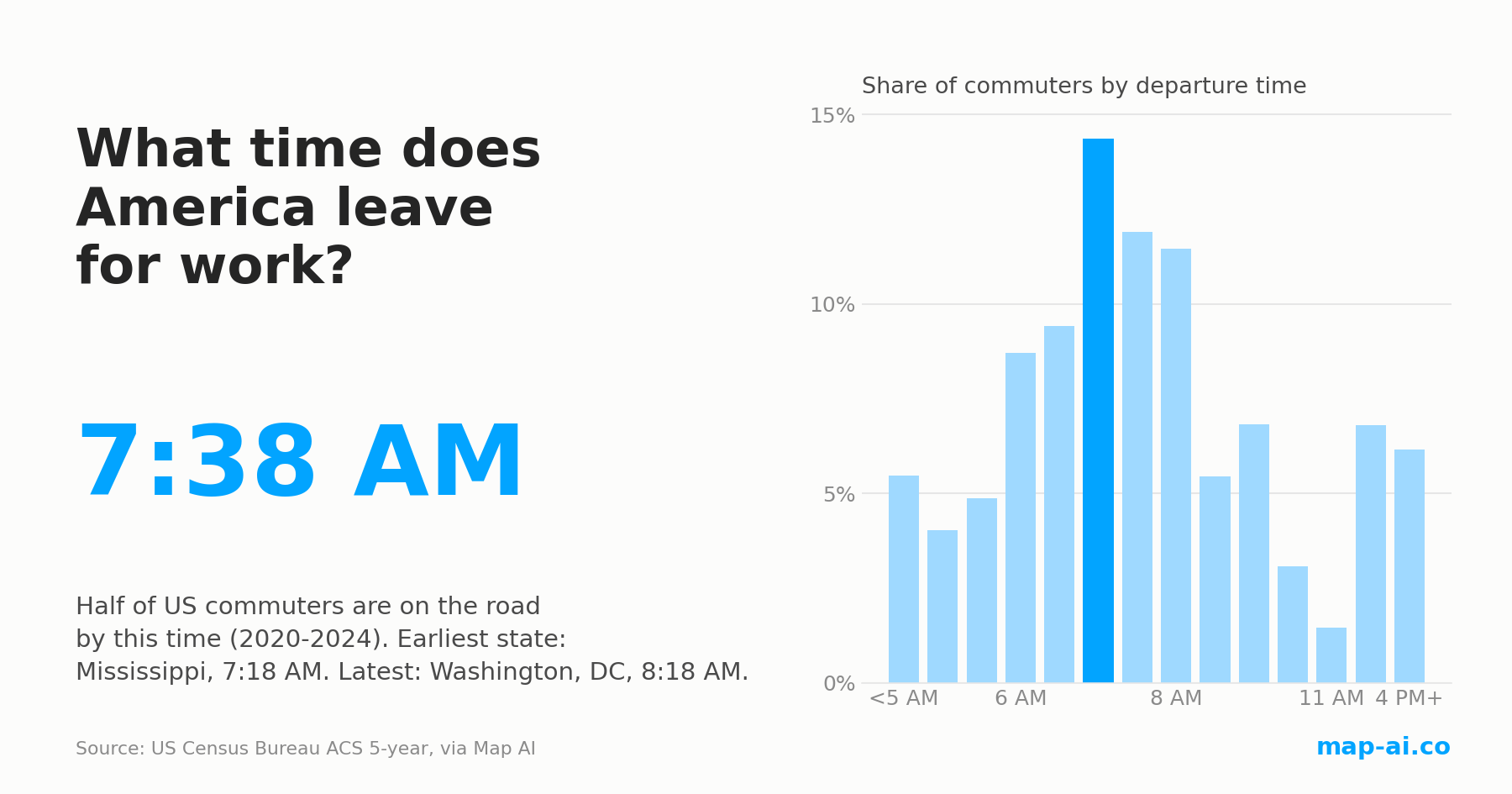
Half of America is on the road by 7:38 AM, and it has barely moved in fifteen years
TLDR: the typical US departure time has sat between 7:37 and 7:39 AM in all sixteen American Community Survey releases since 2009. What changed is the shape of the morning: the share leaving before 6 AM rose from 12.5% to 14.4%, the 6:30 to 8:29 AM rush thinned from 49.4% to 47.1%, and the gap between the earliest and latest county in the country now runs past three hours.
In the latest release, covering 2020 to 2024, half of American commuters had left home by 7:38 AM. In the release covering 2005 to 2009 it was 7:37 AM. Across all sixteen releases the number never left a 1.9 minute band.
That is a strange result for a period that included a pandemic, a remote-work boom and a decade of population growth in the Sun Belt. The explanation is that a median hides everything happening at the ends of the distribution, and at the ends a great deal happened.
The middle stood still. The edges moved.
Split the morning into the fourteen departure windows the Census Bureau publishes and the picture changes completely.
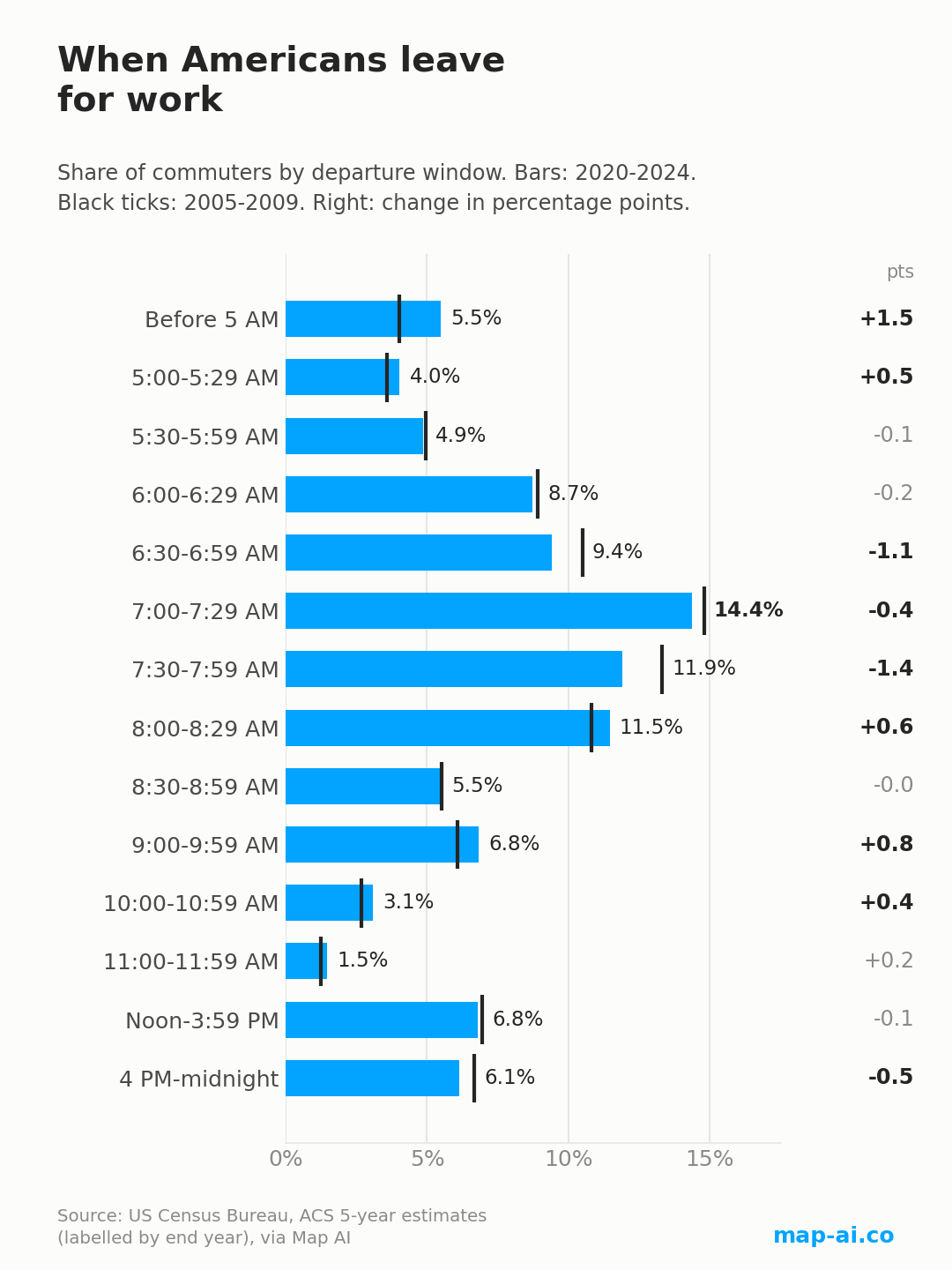
The share of commuters leaving before 6 AM went from 12.5% to 14.4%, and it rose in every one of the fifteen year-on-year steps, without a single reversal. The very early end grew fastest: departures before 5 AM went from 4.0% to 5.5% of commuters, which is 5.4 million people in the earlier window and 7.4 million in the latest one.
The classic rush hour paid for it. Departures between 6:30 and 8:29 AM fell from 49.4% to 47.1%, down in fourteen of the fifteen steps. The single biggest loser is the 7:30 to 7:59 AM window, down 1.4 percentage points, followed by 6:30 to 6:59 AM, down 1.1. The 7:00 to 7:29 AM slot is still the busiest half hour in America, with 14.4% of commuters, but it is a flatter peak than it used to be.
The late end grew too, and more selectively than people assume. Departures at 9 AM or later rose only slightly overall, from 23.6% to 24.3%, because two things moved in opposite directions: the late morning, 9 to 11:59 AM, rose from 10.0% to 11.4%, while afternoon and night departures, noon to midnight, fell from 13.6% to 13.0%.
So the American morning did not shift. It spread out, in both directions at once, and the commute that used to be a two-hour event is slowly becoming a five-hour one.
Did the commute itself get longer? Yes, and then a little shorter
Departure time is only half of the question. The other half is how long the trip takes, and there Map AI's median commute length tells a cleaner story: it rose every year from 21.6 minutes in the 2009 release to 22.6 minutes in the 2019 release, then slipped back to 22.4 minutes in the latest one.
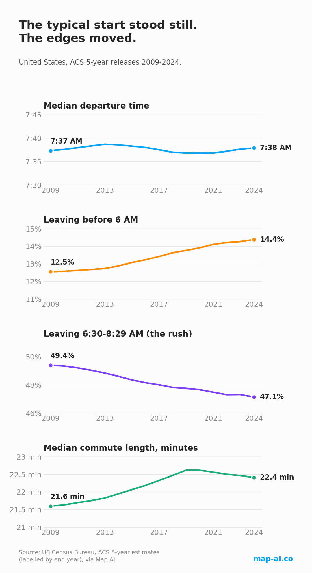
Be careful with that last turn. The Census measures only people who actually travel to work, so when 145.7 million commuters in the 2019 release became 135.8 million in the latest one, the people who left the count were disproportionately office workers who now work from home. A commute that looks shorter on average can simply be a different set of people being measured. We covered where those workers went in how Americans get to work, by state, and what that means for road traffic in the US traffic volume and commute time forecast.
The earliest states in America
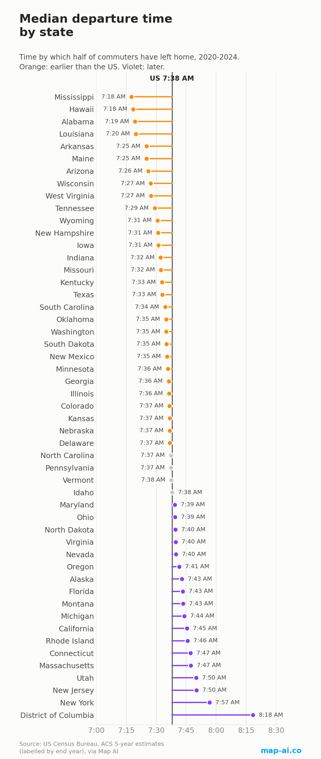
Mississippi has the earliest mornings in the country, at 7:18 AM, ahead of Hawaii by less than a minute. The top of the table is almost entirely the Deep South, where short commutes, manufacturing and shift work all point the same way.
| State | Median departure | Before 6 AM | Since 2009 |
|---|---|---|---|
| Mississippi | 7:18 AM | 16.4% | -2.7 min |
| Hawaii | 7:18 AM | 19.0% | +7.2 min |
| Alabama | 7:19 AM | 17.9% | -0.7 min |
| Louisiana | 7:20 AM | 18.5% | -3.3 min |
| Arkansas | 7:25 AM | 14.8% | -3.1 min |
| Maine | 7:25 AM | 16.0% | -1.0 min |
| Arizona | 7:26 AM | 20.1% | +2.7 min |
| Wisconsin | 7:27 AM | 17.7% | -3.1 min |
| West Virginia | 7:27 AM | 16.3% | -8.1 min |
| Tennessee | 7:29 AM | 15.7% | -0.3 min |
Arizona is the outlier in that group. It is only the seventh earliest state by median, yet it has the highest share of pre-dawn departures in the country, 20.1% of commuters leaving before 6 AM, which is what a hot climate does to outdoor trades. Hawaii is the opposite kind of outlier: second earliest today, and yet the second biggest move towards later mornings since 2009.
The latest states
Washington, DC is in a category of its own at 8:18 AM, more than 20 minutes later than the second-placed state, New York.
| State | Median departure | 9 AM or later | Since 2009 |
|---|---|---|---|
| District of Columbia | 8:18 AM | 27.4% | +9.7 min |
| New York | 7:57 AM | 27.1% | +3.0 min |
| New Jersey | 7:50 AM | 24.5% | +2.2 min |
| Utah | 7:50 AM | 26.3% | +2.4 min |
| Massachusetts | 7:47 AM | 24.5% | +0.4 min |
| Connecticut | 7:47 AM | 24.5% | +2.2 min |
| Rhode Island | 7:46 AM | 24.4% | -0.3 min |
| California | 7:45 AM | 26.7% | +6.3 min |
| Michigan | 7:44 AM | 27.1% | -0.3 min |
| Montana | 7:43 AM | 22.0% | -1.9 min |
Utah is the surprise here. It has the fourth latest mornings in the country while its median commute runs 18.9 minutes, among the shortest anywhere, so its workers are not leaving late because the drive is long. Nevada shows the same independence from the clock in a different way: 29.9% of its commuters leave at 9 AM or later, the highest anywhere, and only 38.8% of departures fall inside the traditional rush, the lowest anywhere. A casino and hospitality economy runs on shifts, not on office hours.
At the other extreme are the two Dakotas, with 57.9% and 57.7% of departures packed into those two morning hours: the most synchronized mornings in the country.
Whose mornings moved, and in which direction
Since the 2009 release, 29 states and DC start earlier and 22 start later, so the country is split almost evenly. Measured from the pre-pandemic 2019 release instead, the balance flips: 19 earlier, 32 later.
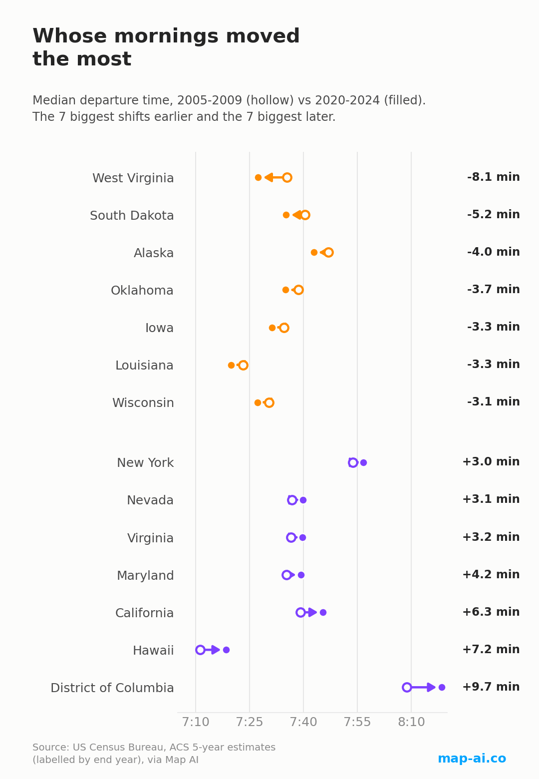
West Virginia made the largest move towards earlier mornings, 8.1 minutes. The largest moves the other way are Washington, DC at +9.7 minutes, Hawaii at +7.2 and California at +6.3. Note what those three have in common and West Virginia does not: a large share of jobs that can be done on a laptop, with the flexible start times that follow.
One trend is close to universal, though. The share of commuters leaving before 6 AM rose in 49 of the 51 states and DC. Wherever the median went, the pre-dawn shift grew underneath it.
The earliest counties: exurbs, factories and bases
Ranking the 615 counties with at least 100,000 residents pulls the pattern into focus.
| County | Median departure | Before 6 AM | 2009 |
|---|---|---|---|
| Liberty, TX | 6:44 AM | 32.4% | 7:01 AM |
| Livingston Parish, LA | 6:53 AM | 31.0% | 6:57 AM |
| Elkhart, IN | 7:03 AM | 33.4% | 7:06 AM |
| Pinal, AZ | 7:03 AM | 30.1% | 7:04 AM |
| Ascension Parish, LA | 7:05 AM | 24.0% | 7:03 AM |
| Kings, CA | 7:07 AM | 25.0% | 7:08 AM |
| Sherburne, MN | 7:08 AM | 22.0% | 7:14 AM |
| Bastrop, TX | 7:08 AM | 22.5% | 7:07 AM |
| Bossier Parish, LA | 7:09 AM | 28.4% | 7:24 AM |
| Franklin, MO | 7:09 AM | 22.7% | 7:10 AM |
Liberty County, Texas is the earliest large county in America at 6:44 AM, 17 minutes earlier than it was in 2009. Its single busiest departure window is not the morning rush at all: 32.4% of its commuters are gone before 6 AM, and the most common time to leave is between midnight and 4:59 AM. It is a far exurb of Houston, and that is what a long drive into a big metro looks like from the inside.
Elkhart County, Indiana has the highest pre-dawn share of any large county, 33.4% leaving before 6 AM. Elkhart is the center of American recreational-vehicle manufacturing, and factory shifts start when the line starts.
Below the 100,000 threshold the extremes get sharper. LaGrange County, Indiana is the earliest of all 3,144 counties at 5:43 AM, with 37.8% of commuters leaving before 5 AM and 53.9% before 6. LaGrange and neighboring Elkhart are home to one of the largest Amish settlements in the United States. Holmes County, Ohio, home to another, is at 6:28 AM.
At the opposite end of the same ranking, the latest county in the United States is the Kusilvak Census Area in western Alaska, at 8:48 AM, three hours and five minutes after LaGrange.
Army towns cluster just behind them: Pulaski County, Missouri at 6:43 AM is home to Fort Leonard Wood, Liberty County, Georgia at 6:58 AM to Fort Stewart, and Christian County, Kentucky at 7:00 AM to Fort Campbell. A 6:30 AM formation moves a county's median in a way no commuting preference can.
The latest counties: campuses and knowledge work
| County | Median departure | 9 AM or later | 2009 |
|---|---|---|---|
| New York, NY | 8:31 AM | 35.6% | 8:25 AM |
| Tompkins, NY | 8:19 AM | 32.7% | 8:23 AM |
| Washington, DC | 8:18 AM | 27.4% | 8:09 AM |
| Santa Clara, CA | 8:17 AM | 34.0% | 8:04 AM |
| Monroe, IN | 8:16 AM | 35.8% | 8:01 AM |
| San Francisco, CA | 8:15 AM | 30.1% | 8:11 AM |
| Kings, NY | 8:14 AM | 31.9% | 8:02 AM |
| Washtenaw, MI | 8:12 AM | 33.4% | 8:04 AM |
| Arlington, VA | 8:11 AM | 24.4% | 8:04 AM |
| Fulton, GA | 8:10 AM | 30.2% | 8:02 AM |
New York County, New York, Manhattan, is the latest large county in America at 8:31 AM, and 35.6% of its commuters do not leave until 9 AM or later. Next on the list is Tompkins County, New York at 8:19 AM, home to Cornell, and one of the few late counties that has moved earlier since 2009, by about three and a half minutes.
The rest of the list is a map of American campuses and tech employment: Monroe County, Indiana (Indiana University), Washtenaw County, Michigan (the University of Michigan), Santa Clara County, California (Silicon Valley) and San Francisco County. Monroe County has the highest late share of any large county, 35.8% leaving at 9 AM or later, which is a 9:30 AM lecture rendered as a statistic.
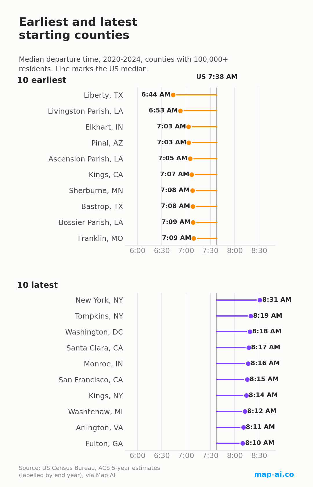
Across all 615 large counties the movement since 2009 is close to a coin flip, 302 earlier against 313 later. The pre-dawn trend is not: the share leaving before 6 AM rose in 553 of them. The biggest single move belongs to Onslow County, North Carolina, home to Camp Lejeune, which went from 6:55 AM to 7:15 AM, a full 20 minutes later.
Does a longer commute mean an earlier alarm?
It is the intuitive hypothesis: if the drive is long, leave sooner. Across the 51 states and DC, median commute length and median departure time correlate at r = +0.37, which is statistically significant but points the wrong way for that story. States with longer commutes leave later, not earlier.
That correlation does not survive much scrutiny. Drop Washington, DC, a single extreme point on both axes, and it falls to +0.20. Test it properly as change against change, comparing each state's shift in commute length since 2009 with its shift in departure time, and it collapses to r = +0.06, indistinguishable from nothing.
The honest reading is that the level correlation is composition, not behavior. Dense metropolitan states have both longer trips and more white-collar jobs with later start times, and it is the second fact doing the work. How long your drive is tells you almost nothing about when you set the alarm. What it does tell you is how far you can actually get in the time you have, which is why a trade area drawn as a drive-time zone beats one drawn as a circle. We walk through that in how to get trade area demographics in seconds.
What this does not show
These are American Community Survey five-year estimates, labelled by the last year of the window, so the release called 2024 covers 2020 to 2024 and the one called 2009 covers 2005 to 2009. Five-year data is the only vintage that reaches every county, which is what makes a 3,144-county ranking possible, but it smooths sharp turns and lags them by roughly two years. Nothing here should be read as dating when a change began; for that, the Census Bureau's single-year series is the right instrument.
The universe is people who travel to work. Anyone working from home is excluded, which matters twice over: the count fell from 145.7 million in the 2019 release to 135.8 million in the latest one, and the people who left were not a random sample of commuters.
The Census windows are coarse, mostly half-hour buckets with open ends at midnight and at 4 PM, and a median has to be interpolated inside whichever window crosses the halfway point. That is why we use a median rather than an average: the open-ended buckets would drag a mean around without telling you anything about an ordinary morning. All clock times are local to each area.
County rankings here are limited to 100,000 residents or more, because survey error at county level grows quickly below that, and the sub-100,000 counties appear only as named callouts. The explanations offered for individual places, the bases, the factories, the campuses, are context for what the numbers show, not something the departure data itself proves.
See more
Source: US Census Bureau, American Community Survey five-year estimates (table B08302, time of departure to work, and travel time to work), aggregated and computed by Map AI. Medians are computed with the same grouped-median formula Map AI's explore pages use, and every figure in this article was re-derived independently from the raw data before publication.
Every commute page on Map AI now carries this breakdown for its own area: the departure-time bars, the typical start next to the state and the country, and how it has moved across releases. Start with the US commute overview, or open the average travel time layer on the interactive map to see it state by state.
More from this series: car, transit and remote work by state, traffic volume versus commute time to 2030, where people still walk to work, and trade area demographics in seconds.

Retirement-friendly

or dominated by young professionals.

Understanding factors like age demographics, neighborhood income, crime rates, and education ranking allows you to feel the vibe of the area more deeply. With Map AI, it’s a breeze to dig into the demographics of any area!
Open mapInstead of manually compiling data from multiple sources, our platform provides real-time insights, saving you time and effort while delivering accurate and actionable information.
Here’s how it works:
1. Launch the platform in your browser.
2. Find the location you’re interested in, by entering an address on the left.
3. Choose the level of data granularity – 1 mi, 5 mi, county or a state.
4. In the menu bar on the right, go to the "Charts" section and select "Population".
5. Click on the neighborhood you’re curious about to view the data.
And voilà!
An interactive map pops up, layered with data on age groups, income brackets, education levels, and even population density.

It’s like having a real estate crystal ball! Whether you’re prioritizing schools, nightlife, or a specific community vibe, Map AI helps you match your lifestyle to the perfect spot. No more guessing or endless Googling—just actionable insights in a few clicks.
Ready to explore? Head to https://interactive-map-ai.com/ and start mapping your future neighborhood today!
Map AI makes exploring demographics easy with its interactive, user-friendly platform. Offering detailed maps and customizable filters, Map AI lets you visualize key demographic data such as age distribution, population density by county, by zip and less, median household income map, and family structures across different neighborhoods. You can access real-time data to make more informed decisions about where to live based on the community that best matches your needs and lifestyle.
Open mapBy using Map AI, you’ll save time and gain a deeper understanding of your potential new home, ensuring you choose the perfect neighborhood for your future.
Check my neighborhoodHere’s why school rankings matter and how Map AI can help you make the best choice.
Why school rankings matter1. Property Value Impact
Homes located in areas with top-rated schools tend to have higher property values and greater potential for long-term appreciation. School quality is a key factor that many homebuyers consider, even if they don’t have children, because it signals a desirable neighborhood with solid community investment.2. Better Educational Opportunities
For families, the proximity to high-ranking schools can be a major deciding factor. Good schools provide better educational opportunities for children, which can translate into future success. Access to quality education is often viewed as a key benefit of living in certain neighborhoods.3. Community Environment
A strong school system often attracts young families, creating a vibrant, family-friendly community. This can lead to a positive social environment with access to various community activities, events, and local organizations.
How Map AI makes comparing school districts simple
Map AI simplifies the process of comparing school districts by offering interactive maps that display school rankings across different neighborhoods.

With just a few clicks, you can visualize how schools in a specific area stack up against each other, compare performance ratings, and see reviews from local residents.
Open mapBy using Map AI, you can make informed decisions about where to buy, ensuring that the neighborhood not only fits your lifestyle but also provides access to the best educational opportunities. Whether you're focused on top-performing schools or simply want to know how a school compares in the area, Map AI makes this data easily accessible and actionable.
Incorporating school rankings into your property search is easy when you have the right tools. With Map AI, you can confidently select a neighborhood that provides excellent education for your children and enhances your home’s long-term value.
For a comprehensive, data-driven approach to analyze a neighborhood, Map AI is the tool you can't afford to miss.
Compare neighborhoodsHow Map AI makes сrime heatmaps easy to use
Map AI takes the power of crime heatmaps to the next level with its user-friendly platform. With just a few clicks, you can explore crime rates by neighborhood that display real-time crime data across America. Map AI’s intuitive interface allows you to customize filters, adjusting the map based on the type of crime you're concerned about, such as violent crimes or property thefts.
You can also zoom in on specific areas to see localized crime patterns, giving you a more detailed view of safety at a granular level. The easy-to-read heatmap visuals make it simple to compare areas, helping you narrow down the safest areas to live in with confidence.
By using Map AI, you get access to accurate, real-time crime data in an easy-to-understand format, making it a must-have tool in your homebuying journey. With Map AI you can make informed decisions that prioritize your safety and peace of mind.
Let us help guide you to the safest places for your next home.

Then select “Filters” from the menu on the right side, choose "Housing" – “Median gross rent” / “ Median home value”, and set your budget.

The map highlights these towns in green, showing median home prices and rental rates.

Zoom in to explore schools, parks, and shopping options—everything a homebuyer needs to decide. Forget endless searches; Map AI puts affordability and convenience on one screen. Check it out at https://interactive-map-ai.com and start planning your move today!
Just for you
Still searching for the right place?
Use Map AI to explore, compare, and find the best fit - all with detailed insights and smart reports on any neighborhood.


