
Still searching for the right place?
Use Map AI to explore, compare, and find the best fit - all with detailed insights and smart reports on any neighborhood.

How Americans Get to Work: Car, Transit and Remote Work by State (2009-2023)

September 3, 2026

12 min to read
Most Americans still drive to work, but the share just hit a 15-year low
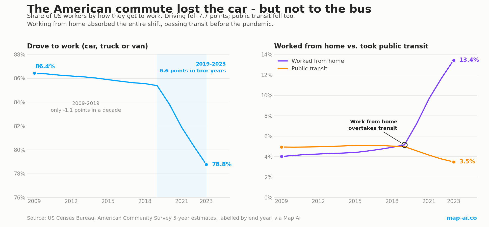
In 2023, 78.8% of American workers commuted by car, truck or van. In 2009 it was 86.4%. That 7.7 point drop is the largest change in how Americans get to work across the fifteen years of data behind this article, and it pushed driving below 80% for the first time in the series.
The interesting part is not the size of the drop. It is the timing.
Between 2009 and 2019, the car's share of US commuting fell by just 1.05 points, from 86.4% to 85.4%, roughly a tenth of a point per year. Between 2019 and 2023 it fell 6.6 points. The car lost more commuting share in those four years than in the previous ten, by a factor of six.
One note on reading every figure below. These are American Community Survey five-year estimates, labelled by the last year of the window, so "2023" means the 2019-2023 period and "2019" means 2015-2019. Five-year estimates are what makes state-by-state and county-by-county comparison possible at all, because single-year files do not cover smaller geographies reliably. The trade-off is that they smooth sharp turns, and further down we compare them directly against the Census Bureau's single-year series to show exactly where that matters.
Public transit did not win. It lost too.
The obvious assumption is that people got out of cars and onto buses and trains. The data says the opposite.
Public transit's share of US commuting fell from 4.94% in 2009 to 3.49% in 2023. It peaked at 5.11% in the window ending 2015 and was already sliding well before 2020, which means the pandemic accelerated a decline that had started years earlier.
In absolute terms the loss is sharper than the percentages suggest. About 7.65 million Americans commuted by public transit in the 2019 window. By 2023 it was 5.52 million, a loss of roughly 2.1 million riders even as the total workforce grew.
What absorbed the car's lost share was working from home, which went from 4.0% of commuters in 2009 to 13.4% in 2023. That is 5.6 million people rising to 21.3 million.
The crossover is the part worth pausing on: working from home overtook public transit as an American commute mode before the pandemic, at 5.15% against 4.98% in the window ending 2019. By 2023 the gap was not close. Nearly four Americans worked from home for every one who took transit. Of the 50 states and DC, exactly one still has more transit commuters than home workers: New York.
How these figures compare with other research
A single dataset is one instrument, and it is worth checking it against others. Three independent sources line up with the picture above, and the places where they diverge are as informative as the places where they agree.
The Census Bureau's own single-year estimates agree on the level. The Bureau's ACS 1-year commuting estimates put public transportation at 3.5% of workers in 2023. The five-year figure used here is 3.49%. Work from home lands at 13.8% against our 13.4%. For a dataset built by aggregating census tracts rather than reading the national table, that is close agreement.
They disagree on timing, and the single-year series is right about it. In Commuting in the United States: 2022 (ACSBR-018, February 2024), Census analysts Michael Burrows and Charlynn Burd report transit falling from 5.0% of workers in 2019 to 2.5% in 2021, which they call the lowest share ever recorded by the ACS, then recovering to 3.1% in 2022. It reached 3.5% in 2023 and 3.7% in 2024. Work from home ran the opposite way: 5.7% in 2019, a peak of 17.9% in 2021, then 15.2%, 13.8% and 13.3%.
In other words, both trends turned in 2021. Transit bottomed and has been recovering for three years; work from home peaked and has been receding. A five-year window ending in 2023 still has 2019, 2020 and 2021 inside it, so it shows work from home rising and transit falling straight through to 2023. That is smoothing, not a live trend, and anyone reading five-year commute data without accounting for it will call a turning point three years late.
The pre-pandemic crossover checks out from a second direction. Writing for the Eno Center for Transportation in 2019, Romic Aevaz noted that transit had ticked down from 5.2% of commuters in 2014 to 4.9% in 2018, while telework rose from 4.5% to 5.3% and passed transit for the first time in 2017. Our five-year series dates the same crossover to the window ending 2019, which is centred on 2017. The two datasets are not in conflict; they are the same event seen through a wider lens.
Transit ridership and transit commuting are not the same measure. The American Public Transportation Association counted 7.1 billion transit trips in 2023, up 16% on 2022 and back to 79% of 2019 levels. That looks healthier than the commute share, and both can be true: APTA counts every trip, while the ACS counts how people usually get to work. Transit has recovered off-peak, weekend and non-work travel considerably faster than it has recovered the weekday commute, which is the segment remote work took away.
The practical reading is that our five-year data is the right instrument for comparing places, and the single-year series is the right instrument for dating a turn. This article uses the first for geography and defers to the second on timing.
The states cutting car commuting fastest
| State | Car share 2009 | Car share 2023 | Change | Work from home 2023 |
|---|---|---|---|---|
| District of Columbia | 43.8% | 32.4% | -11.4 pts | 29.4% |
| Massachusetts | 81.0% | 69.6% | -11.4 pts | 16.7% |
| Washington | 84.0% | 73.4% | -10.6 pts | 17.7% |
| Virginia | 88.0% | 77.4% | -10.6 pts | 16.3% |
| Colorado | 85.1% | 74.7% | -10.5 pts | 18.8% |
| Arizona | 88.5% | 78.3% | -10.1 pts | 16.5% |
| North Carolina | 91.8% | 81.8% | -10.1 pts | 14.5% |
| Maryland | 83.8% | 74.1% | -9.8 pts | 17.2% |
| New Jersey | 81.0% | 71.4% | -9.6 pts | 15.1% |
| Connecticut | 87.8% | 78.4% | -9.4 pts | 14.5% |
Look at what this list is not. It is not a ranking of states with the best public transport. Arizona and North Carolina both cut car commuting by more than 10 points while their transit shares stayed under 1.2%. Every state here has a large share of desk work that can be done remotely, and the right-hand column is doing the explaining. Massachusetts cut car commuting by 11.4 points while its own transit share fell from 9.1% to 7.0%.
The clearest case is the District of Columbia, where the car share dropped to 32.4%, the lowest of any US jurisdiction, while work from home reached 29.4%, the highest. DC is close to the point where as many of its workers stay home as drive.
This ordering is not an artefact of our aggregation. Burrows and Burd's single-year analysis independently names Colorado, the District of Columbia and Washington as the only states where 20% or more of workers were home-based in 2022, and Mississippi, North Dakota and Puerto Rico among the lowest at around 8% or less. Two different ACS vintages, processed separately, pick out the same states at both ends.
New York just became the country's top transit state
Through 2022, the District of Columbia had the highest public transit share in America. In 2023 that changed.
| State | Transit share 2009 | 2019 | 2023 |
|---|---|---|---|
| New York | 26.6% | 28.0% | 22.5% |
| District of Columbia | 37.1% | 34.7% | 22.3% |
| New Jersey | 10.4% | 11.7% | 8.5% |
| Massachusetts | 9.1% | 10.4% | 7.0% |
| Illinois | 8.8% | 9.5% | 6.4% |
| Maryland | 8.7% | 8.4% | 4.9% |
| Hawaii | 5.7% | 6.2% | 4.1% |
| Washington | 5.5% | 6.6% | 4.0% |
| Pennsylvania | 5.4% | 5.6% | 3.9% |
New York now leads at 22.5% against DC's 22.3%, and it got there by falling more slowly rather than by growing. DC's transit share dropped 14.8 points from its 2009 level, the steepest decline of any state or district in the country, driven by a federal and professional workforce that moved to remote work almost wholesale.
The metro-level numbers in the Census brief show the same collapse from a different angle: the Washington DC metro area had fewer than half as many transit commuters in 2022 as in 2019, falling from about 441,000 to 206,000, while the New York metro lost roughly 700,000 transit commuters over the same three years. Our state-level figures and their metro-level figures are measuring the same retreat.
Note also that most of these states peaked in the 2019 window, not in 2009. Transit was gaining share in New York, New Jersey, Massachusetts, Illinois and Washington right up to the pandemic. The exception is Maryland, which was already losing transit share before 2020.
Where the car still rules
At the other end, fifteen states still put more than 85% of their commuters in a car. These are the eight highest:
| State | Car share 2023 | Work from home | Transit |
|---|---|---|---|
| Mississippi | 91.7% | 5.3% | 0.25% |
| Alabama | 89.7% | 7.8% | 0.32% |
| Arkansas | 89.3% | 7.8% | 0.29% |
| Oklahoma | 88.1% | 8.5% | 0.28% |
| Louisiana | 88.0% | 7.2% | 0.91% |
| North Dakota | 87.7% | 7.3% | 0.37% |
| West Virginia | 87.5% | 8.0% | 0.60% |
| Kentucky | 87.0% | 9.1% | 0.68% |
The spread between the extremes is enormous. A worker in Mississippi is 2.8 times more likely to drive to work than a worker in the District of Columbia, 91.7% against 32.4%, a gap of 59.3 percentage points on the same measure in the same year.
North Dakota is the most stable commute market in the country. Its car share went from 88.5% in 2009 to 87.7% in 2023, a decline of 0.83 points across fourteen years, while the national figure fell 7.7. Wyoming and South Dakota both fell about 2.0 points, and Alabama and Arkansas sit near the same end. Remote work has less to work with in economies built on agriculture, extraction, healthcare and manufacturing, where the job requires a physical location.
Walking and cycling: small shares, sharp geography
Walking accounts for 2.4% of US commuting and cycling for 0.45%, and both have edged down since 2009 as remote work removed the short trips they were best at. Both remain highly concentrated:
- Walking: District of Columbia 10.0%, Alaska 7.5%, New York 5.7%, Vermont 4.3%, Hawaii 4.2%, Massachusetts 4.2%
- Cycling: District of Columbia 3.3%, Oregon 1.4%, Montana 1.1%, Colorado 0.95%, Wyoming 0.83%
Alaska at 7.5% is the surprise on the walking list, and a good reminder that this metric is not purely about urban density or mild weather. Isolated communities where the workplace sits inside the settlement produce high walking shares for entirely different reasons than Manhattan does.
Did commute times get shorter after COVID? Only where people could work from home
If millions of people stopped commuting, you would expect the roads to clear and the remaining trips to get quicker. The median US commute did peak and turn, but the size of the move is smaller than the headline suggests, and the geography of it is the interesting part.
The median one-way commute rose steadily for a decade, from 21.6 minutes in 2009 to 22.6 minutes in 2019, then peaked exactly in 2019 and has edged down every year since, to 22.5 minutes in 2023. That is a fall of about nine seconds off the median trip. After ten years of the commute getting reliably longer, it stopped and reversed in the same year work from home passed public transit.
One point about what this number measures, because it is easy to get wrong: this median covers only people who physically travel to work. Home workers are excluded from the universe entirely rather than counted as zero-minute commutes, so the shortening is not an artefact of adding a pile of stay-at-home zeros. Among people still making the trip, the trip itself got marginally shorter.
Nationally that shift is small. At state level it splits in two directions:
| Commute time fell most (2019 to 2023) | Change | Commute time rose most | Change |
|---|---|---|---|
| Maryland (30.7 to 28.8 min) | -1.9 min | West Virginia (21.1 to 21.6 min) | +0.5 min |
| Illinois (25.7 to 23.8 min) | -1.9 min | Mississippi (21.0 to 21.4 min) | +0.4 min |
| New York (30.4 to 29.0 min) | -1.5 min | Montana (15.7 to 16.0 min) | +0.4 min |
| California (25.0 to 23.6 min) | -1.4 min | South Carolina (22.0 to 22.2 min) | +0.3 min |
| Massachusetts (26.8 to 25.7 min) | -1.1 min | Tennessee (22.1 to 22.4 min) | +0.3 min |
| New Jersey (27.5 to 26.6 min) | -0.9 min | Arkansas (18.3 to 18.5 min) | +0.3 min |
Twenty-three states saw the median commute fall and twenty-eight saw it rise. The two lists are not random: the states where commutes got shorter are the same states that appear at the top of the work-from-home table, and the states where commutes got longer are the car-dependent ones with little remote work. Across all 51 jurisdictions the correlation between the change in work-from-home share and the change in commute time is -0.49, which is a clear relationship for state-level data with this much local variation in it.
The mechanism is straightforward once stated. Remote work removes trips selectively, not evenly. It takes the longest trips first, because the office jobs that went remote were disproportionately the downtown ones people travelled furthest to reach. Take a slice of long trips out of Maryland's or Illinois's distribution and the median of what remains falls. In states where almost nobody could work remotely, no trips were removed and ordinary congestion growth carried on.
The District of Columbia is the exception that confirms the pattern. It has the country's highest work-from-home share at 29.4% and still the longest median commute in America at 30.6 minutes, barely changed from 30.8 in 2019. The people who remain commuting into DC are the ones who cannot do the job from a laptop, and they were never the short-trip group to begin with.
The catch: a smaller share of commuters can still mean more cars
Here is the part that matters most for anyone planning around traffic, and the most commonly misread number in this dataset.
The car's share of American commuting fell 7.7 points. The number of Americans driving to work went up.
In 2009, about 121.0 million people drove to work. In 2023, about 124.8 million did, an increase of roughly 3.8 million drivers. The share fell because the workforce grew by 18.4 million over the same period, from 140.0 million to 158.4 million. The denominator simply grew faster than the car lost ground.
This holds at state level too, including for states near the top of the car-reduction table:
- North Carolina cut its car share by 10.1 points and still added about 274,000 car commuters, because its workforce grew 20.4%.
- Colorado cut its car share by 10.5 points and added about 228,000 car commuters on 26.8% workforce growth.
- Arizona added about 143,000 and Washington about 141,000 on the same pattern.
Only a handful of places, Massachusetts, Virginia and DC among them, actually reduced the absolute number of people driving to work.
There is a second number underneath this one. The count of people who physically travel to work, as opposed to the count of people employed, fell from 145.7 million in 2019 to 137.1 million in 2023. That is 8.6 million fewer daily commute trips, a 5.9% drop, at a time when total employment rose by 4.8 million. Fewer commute trips and more car commuters are not a contradiction: the trips that disappeared were disproportionately the transit and long-distance ones.
Independent traffic-sensor data says the same thing from the opposite direction. In its COVID impact analysis, Ticon studied 168 road sections across 26 sites in Pennsylvania, Indiana, Kentucky and Ohio between July 2021 and May 2022. Traffic demand recovered strongly overall, from an index of 0.93 to 1.25. But the recovery was uneven in a specific and revealing way. Weekend demand rebounded harder than weekday demand, 1.41 against 1.32 on average. And 19% of the road segments studied barely recovered at all, growing just 9%; Ticon notes that those segments show classic commuting intraday patterns, with sharp weekday morning and evening peaks, and gives the example of a Cincinnati-area artery congested around 8am.
Two entirely different instruments, a household survey and roadside sensors, land on the same conclusion. Shopping trips, weekend travel and discretionary driving came back. The weekday commute did not, because 8.6 million of those trips stopped being made. Ticon also measured how severe the initial shock was: traffic fell by up to 75% on some roads, Massachusetts flows dropped to about 15% of February levels by early April 2020, and volumes near one strip mall fell 33% to 54%, taking four months to recover. The volume came back; the commute peak is the part that did not.
We followed this thread further in a companion analysis of US traffic volume against commute time, using Federal Highway Administration vehicle-miles data. The short version: American driving tracked commuting closely for a decade, correlating at +0.79 on year-over-year changes through 2019, and then the relationship broke. Total vehicle-miles are back at their pre-pandemic peak and forecast to reach 3.42 trillion by 2030, while the commute has flatlined.
If you are siting a business, modelling a catchment or forecasting congestion, commute mode share tells you about the composition of local travel demand, not its volume. For measured vehicle volumes on specific road segments you want traffic counts instead. TrafficZoom's US traffic count data covers AADT and segment-level counts, which is the right instrument for that question. Commute mode answers "how do people here travel"; traffic counts answer "how many vehicles pass this point". A retail site on a corridor in a fast-growing county can easily see rising traffic and a falling car commute share at the same time, and reading only the second number would tell you exactly the wrong thing.
What is actually driving the shift
Three things are visible in the data rather than assumed:
- Remote work is the whole story, and it is occupation-driven. The rank order of car-share decline tracks professional and administrative employment closely. DC, Massachusetts, Washington, Virginia, Colorado and Maryland lead both lists, and the Census Bureau's independent single-year analysis picks out the same states.
- Transit's decline started before 2020. Both this dataset and the Eno Center's reading of the single-year series show transit losing commute share from roughly 2014-2015 onward. Any explanation resting entirely on the pandemic has to account for the five years of decline that preceded it.
- The pandemic compressed a trend rather than creating one. Work from home passed transit in 2017 on single-year data and in the window centred on 2017 in ours. What 2020 did was compress about fifteen years of drift into three.
The open question is what happens next, and here the single-year data is already answering. Work from home peaked at 17.9% in 2021 and has fallen for three consecutive years to 13.3% in 2024. Transit bottomed at 2.5% in 2021 and has risen for three consecutive years to 3.7%. Neither has returned to its 2019 position, and neither is still moving in the direction the smoothed five-year series appears to show. The next few ACS releases will tell us whether that is a partial reversion or a new equilibrium.
How we compiled this and where the numbers come from
Every Map AI figure in this article comes from the US Census Bureau's American Community Survey, means of transportation to work and travel time to work, five-year estimates, as ingested and aggregated in the Map AI data platform. Coverage is the windows ending 2009 through 2023 for all 50 states, the District of Columbia and Puerto Rico. Puerto Rico is held in the platform but excluded from the state rankings above, since it is a territory rather than a state.
Methodology notes so the numbers can be checked and reproduced:
- Shares are of commuters, not of population. The denominator is workers aged 16 and over, which this dataset puts at 158.4 million for the 2023 window.
- "Car" combines drive-alone and carpool, matching the ACS car, truck or van category. The Census single-year series splits them: 69.2% drove alone and 8.6% carpooled in recent years, and carpooling has fallen faster than solo driving.
- "Worked from home" is a commute mode in the ACS, not a separate employment status, which is why it sits in the same denominator as driving and transit and can be compared with them directly.
- Commute time is a grouped median over travellers only. Median travel time is computed from the ACS travel-time-to-work bracket distribution using the same grouped-median method Map AI's explore pages use, and its universe excludes people who work from home rather than counting them as zero.
- Values are aggregated upward from census tract and block group geographies, so the state and national figures here are internally consistent with the county and place figures on Map AI's explore pages.
- Five-year estimates lag. Each figure is an average over the five years ending in the labelled year. This is what makes small-geography comparison possible, and it is also why we defer to the Census single-year series for anything about when a trend turned.
- Small changes are noise. Year-over-year movements below roughly half a point in small states sit inside ACS margins of error, which is why this article works with 14-year and 4-year changes rather than annual ones.
- The 2020 single-year file was never released in standard form. The Census Bureau flagged serious nonresponse bias and published experimental estimates instead, so 2020 appears in five-year windows but not as a standalone comparison year here.
Map AI maintains this dataset as part of a wider geospatial platform covering income, housing, health, crime, demographics and points of interest for every US state, county and place. The commute figures here are the same ones served on its public explore pages, so every claim above can be checked against the source page for each state.
Explore the commute data yourself
Each state has its own commute page with mode split, average travel time, peak departure times and county-level comparison:
- District of Columbia commute data - lowest car share, highest work from home
- New York commute data - the country's top transit state
- Massachusetts commute data - the biggest car-share drop among the 50 states
- Washington and Colorado commute data - the remote-work leaders
- Virginia, Maryland, New Jersey and Illinois commute data - where commute times fell most
- Arizona and North Carolina commute data - big car declines without transit
- Mississippi, Alabama and Arkansas commute data - where the car still rules
- United States commute overview - the national picture
Commute patterns track income and population growth closely, so this is worth reading alongside the richest and poorest states by median household income and the ten fastest-growing states by population. The states adding workers fastest are the same ones where a falling car share still produced more cars on the road.
See more
Map AI data source: US Census Bureau, American Community Survey five-year estimates, means of transportation to work and travel time to work, windows ending 2009 through 2023, aggregated by Map AI.
Companion analysis: US traffic volume vs commute time, and what 55 years of vehicle-miles data predicts for 2030.
External sources cited above, each reporting its own figures independently of Map AI:
- US Census Bureau, ACS 1-year commuting estimates
- Michael Burrows and Charlynn Burd, "Commuting in the United States: 2022", ACSBR-018, US Census Bureau, February 2024
- Romic Aevaz, Eno Center for Transportation, 2018 ACS commuting analysis
- American Public Transportation Association, 2023 ridership report
- Ticon, "Impact Analysis" case study, Part III: COVID Impact, February 2023
- TrafficZoom, US traffic count data

Retirement-friendly

or dominated by young professionals.

Understanding factors like age demographics, neighborhood income, crime rates, and education ranking allows you to feel the vibe of the area more deeply. With Map AI, it’s a breeze to dig into the demographics of any area!
Open mapInstead of manually compiling data from multiple sources, our platform provides real-time insights, saving you time and effort while delivering accurate and actionable information.
Here’s how it works:
1. Launch the platform in your browser.
2. Find the location you’re interested in, by entering an address on the left.
3. Choose the level of data granularity – 1 mi, 5 mi, county or a state.
4. In the menu bar on the right, go to the "Charts" section and select "Population".
5. Click on the neighborhood you’re curious about to view the data.
And voilà!
An interactive map pops up, layered with data on age groups, income brackets, education levels, and even population density.

It’s like having a real estate crystal ball! Whether you’re prioritizing schools, nightlife, or a specific community vibe, Map AI helps you match your lifestyle to the perfect spot. No more guessing or endless Googling—just actionable insights in a few clicks.
Ready to explore? Head to https://interactive-map-ai.com/ and start mapping your future neighborhood today!
Map AI makes exploring demographics easy with its interactive, user-friendly platform. Offering detailed maps and customizable filters, Map AI lets you visualize key demographic data such as age distribution, population density by county, by zip and less, median household income map, and family structures across different neighborhoods. You can access real-time data to make more informed decisions about where to live based on the community that best matches your needs and lifestyle.
Open mapBy using Map AI, you’ll save time and gain a deeper understanding of your potential new home, ensuring you choose the perfect neighborhood for your future.
Check my neighborhoodHere’s why school rankings matter and how Map AI can help you make the best choice.
Why school rankings matter1. Property Value Impact
Homes located in areas with top-rated schools tend to have higher property values and greater potential for long-term appreciation. School quality is a key factor that many homebuyers consider, even if they don’t have children, because it signals a desirable neighborhood with solid community investment.2. Better Educational Opportunities
For families, the proximity to high-ranking schools can be a major deciding factor. Good schools provide better educational opportunities for children, which can translate into future success. Access to quality education is often viewed as a key benefit of living in certain neighborhoods.3. Community Environment
A strong school system often attracts young families, creating a vibrant, family-friendly community. This can lead to a positive social environment with access to various community activities, events, and local organizations.
How Map AI makes comparing school districts simple
Map AI simplifies the process of comparing school districts by offering interactive maps that display school rankings across different neighborhoods.

With just a few clicks, you can visualize how schools in a specific area stack up against each other, compare performance ratings, and see reviews from local residents.
Open mapBy using Map AI, you can make informed decisions about where to buy, ensuring that the neighborhood not only fits your lifestyle but also provides access to the best educational opportunities. Whether you're focused on top-performing schools or simply want to know how a school compares in the area, Map AI makes this data easily accessible and actionable.
Incorporating school rankings into your property search is easy when you have the right tools. With Map AI, you can confidently select a neighborhood that provides excellent education for your children and enhances your home’s long-term value.
For a comprehensive, data-driven approach to analyze a neighborhood, Map AI is the tool you can't afford to miss.
Compare neighborhoodsHow Map AI makes сrime heatmaps easy to use
Map AI takes the power of crime heatmaps to the next level with its user-friendly platform. With just a few clicks, you can explore crime rates by neighborhood that display real-time crime data across America. Map AI’s intuitive interface allows you to customize filters, adjusting the map based on the type of crime you're concerned about, such as violent crimes or property thefts.
You can also zoom in on specific areas to see localized crime patterns, giving you a more detailed view of safety at a granular level. The easy-to-read heatmap visuals make it simple to compare areas, helping you narrow down the safest areas to live in with confidence.
By using Map AI, you get access to accurate, real-time crime data in an easy-to-understand format, making it a must-have tool in your homebuying journey. With Map AI you can make informed decisions that prioritize your safety and peace of mind.
Let us help guide you to the safest places for your next home.

Then select “Filters” from the menu on the right side, choose "Housing" – “Median gross rent” / “ Median home value”, and set your budget.

The map highlights these towns in green, showing median home prices and rental rates.

Zoom in to explore schools, parks, and shopping options—everything a homebuyer needs to decide. Forget endless searches; Map AI puts affordability and convenience on one screen. Check it out at https://interactive-map-ai.com and start planning your move today!
Just for you
What Time Do Americans Leave for Work? Commute Start Times by State and County
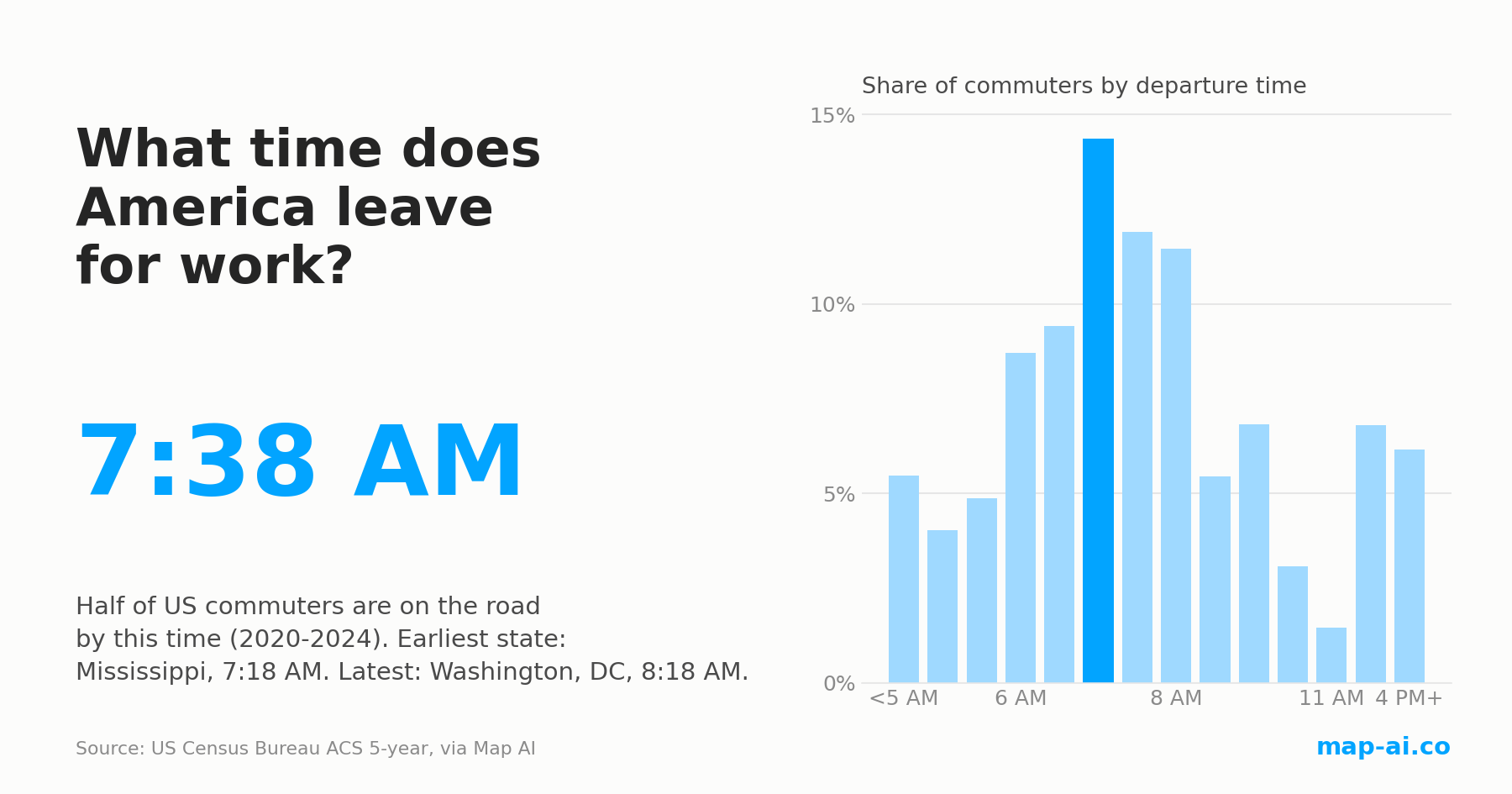
Half of US commuters are on the road by 7:38 AM, the same as in 2009. The morning still changed: here is where America starts earliest and latest.
Read more
Still searching for the right place?
Use Map AI to explore, compare, and find the best fit - all with detailed insights and smart reports on any neighborhood.


